

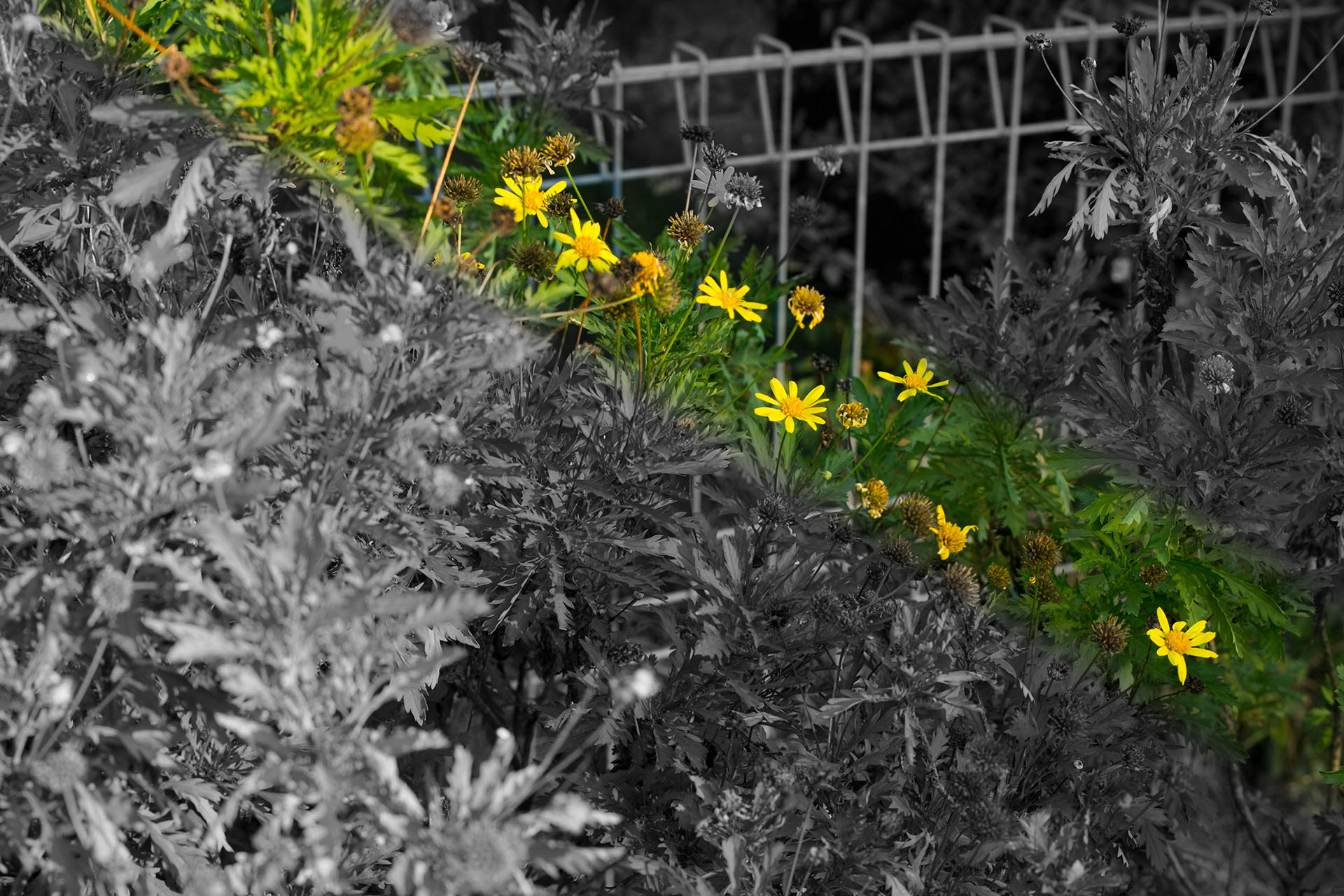
I was struggling with working out what to post this week. I wanted to revisit a technique I "invented" at Tafe (I have no doubt other people have already done this before me but the thought occurred to me independently of anyone else) that involved adding a gradient mask to a saturation layer, which is ultimately what you're seeing in the image here. Trouble is, it was originally applied to a portrait, and as I learned yesterday, it's more situational when it comes to other subjects. It all has to do with emphasis, and which elements you're using to draw the eye into which parts of the image. Most often that's accomplished with just focus and/or composition, and so depending on the image, using color to emphasize can become a bit redundant. But in this case, the selective color band does actually help highlight that the flowers are all lined up rather nicely, something I didn't really notice myself until several viewings later, and that's why I picked this one for the post instead of other candidates. See for yourself, by comparison to the original image:
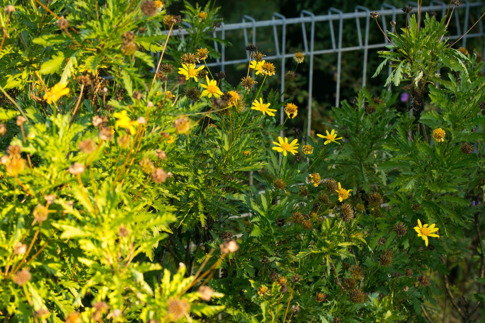
Perhaps it's less obvious to you since you've seen the final result, but without something to highlight that specifically, I think it's much less obvious. Frankly, the final image is still a fairly average one, but I appreciate the knowledge gleaned from the process and the further week of content it will have contributed to when I try that technique again later on down the line.
EXIF data:
1/100, f/8, ISO 320
70mm focal length
EXIF data:
1/100, f/8, ISO 320
70mm focal length